Pattern to Inspire... Something for the Weekend?

A colleague was telling me yesterday of her visit to Bermondsey to the bright orange and pink palace of Queen Zandra of Rhodes - The Fashion and Textiles Museum.
There's an exhibition of three women post war textile designers on at the moment

ftm

Think I feel a trip to London coming on... I'll have to be taking my budding fashion designer of an older son along too - he's such good company

ftm

One of the designers whose work is on show is a favourite of mine - Lucienne Day


Here are some of her beautiful designs - so inspiring - and of their time; the optimism and excitement for the future through science and technology quite evident..

guardian


Also - simple natural forms seem to inspire Day to create delightful designs that are feeling contemporary again today

design boom blog


Mmmmmmm - that's set me up for the weekend now - have fun in the sun!

Sheepish Sam Storyboard

Have a look at my Illustration Page - I've just popped an image up there which shows the very first thoughts for an idea that a friend of a friend has for a picture book...

At Risk of Being Sexist.....

How exciting - lots going on:

My lovely and long-time friend Paula has her drawing for the concept of a Chelsea Flower Show garden on the RHS website!!  It looks wonderful - striking and by far the strongest of all those represented on the site, it carries the design of the garden through its drawing style. Congratulations to both Freddie and Paula.


Another lovely 'short-time' friend Corrin Tulk has her paintings in a number of shows around Norfolk over the next few months - Wymondham - in April, Norfolk Open Studios from the end of May to early June - at her pretty home in Upton and Norwich Playhouse Theatre for the whole of July - to name a few. See more of her art and all the details for the shows at Corrin's website


A former colleague Chris Hann and Hannah Hann along with others have their annual show at Burnham Overy Staithe in early April. 
I recently saw their exhibition at the Assembly House in Norwich. Both painters' work references similar influences but they depict those in such different and individual ways. I love how they compliment each other perfectly!


At risk of being sexist and over simplifying things - I think Chris's paintings tell they are made by a man whereas Hannah's work is utterly feminine.


Their imagery, colours and drawing style seem borne of the Cornish mid twentieth century artist; a hint of the Winifred Nicholson and Mary Potter in Hannah's art and in Chris's work a nod to Patrick Heron and Ben Nicholson - lovely yum yum

A couple of weeks ago Corrin asked me to a talk by the writer Ian Collins; focussing on his recent book with David Attenborough exploring the work of John Craxton.  It was really inspiring - his later work a riot of colour and intense marks - like mosaics.
David Attenborough is a collector of Craxton's work. 


It was difficult to know which image to use here as an example of Craxton's work - it changed so much over the years... Actually, I think David Hockney's recent paintings have a feel of some of Craxton's - look...compare this one of a woodland floor to the painting for sale at Sotherby's

What Makes You an Illustrator?

It's one thing to be able to draw with accuracy and in a representational way - but quite another to turn your skills to those of an illustrator.  How do you start?


Well - that's just where I am at right now...
I'm learning that it is most important to continue to draw, draw, draw - because out of practise develops two skills:
  • a 'store' inside your head and hand of pictures of things and how they work visually
  • a 'signature' - a way of working that can be recognised as yours 
  
I fear I am yet to discover mine!! - I seem to have several different ways of drawing, all of which I enjoy.  Unfortunately for me - and maybe you too? - I think agents and publishers like to be able to rely on a consistency of style; then they know what they're dealing with and what to expect.


I have thought about having a number of different portfolios; one for each 'style' as it were... but then - do you find this? - when I try to categorise my illustrations, designs and artwork - stuff doesn't seem to 'fit'!

Over the next few weeks I plan to attampt to collect together two or three groups of around ten to fifteen pieces of artwork that 'speak the same language' - and in doing so, there will be gaps... Join me as I set myself tasks to fill those gaps.  I will complete images to:

  1 Illustrate an existing poem - maybe an Edward Lear nonsense poem (no copyright!)?
  2 Illustrate an existing article from a magazine and
  3 Map out the idea for a simple children's picture book - with two finished Illustrations and pages of pencil drawings...

How to Design what Agents want..?

Do you ever get a block when trying to look at your own work objectively? Feel like you are SO close and involved with your artwork that distancing yourself from it is almost impossible?
Me too.  (Naturally we want everyone to love our art, designs, illustrations unconditionally...!)


So what strategies have I developed for dealing with this?


Well, for me sending samples of designs and illustrations off to agents (and getting rejected!) has been good practise.
You definitely feel rejected if your work is rejected - as really it is a little bit of you.

But you have to just carry on - keep trying.
Rework the designs or try a different combination and send them off again to somewhere else.
I also think reading between the lines is a skill worth developing. I get feedback like
'your work is very creative' followed by something like: but it's not appropriate for our portfolio at present -
And that's the helpful ones!! - I tell myself - ALL feedback is useful - even the straight negative feedback! Just turn the comments round - translate - interpret - dissect

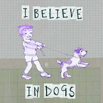
So I need to dissect 'your work is very creative'...
I have interpreted it as this:
Very = too
Creative = all over the place
Which, joined up with not what we want says to me that I will have to develop a more 'together' style that has more clarity and says 'these designs are clearly all by Annie B' - a kind of signature.

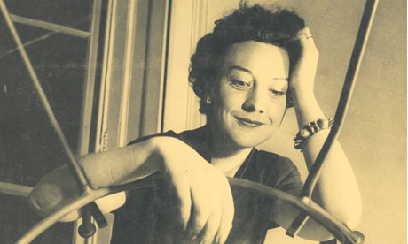
Someone I really admire and have watched go through this process over the last five years is Chris Loukes. We were fellow MA students and (with several others) still get together regularly to critique our work. Take a look at this CV to realise that he has got his work into some really great shows and is now an International Artist.


His applications were rejected again and again initially - but with persistence Chris gradually got his video art accepted for exhibitions and prizes and now his work seems to go from one show to the next!
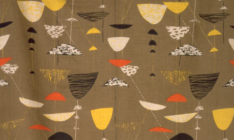
(I tried to embed one of your videos here Chris - but it didn't happen, so here's one of the photographs from your lovely gentle blog)

Which takes us back to the start of this post.
And I suppose I have to admit it tells me I do really know what is required for my artwork to develop appropriately after all. No excuses then!
A bit of constructively critical self-questioning and a long hard look at the evidence will help you to develop as a creative person.

So - come on - let's do it:

1 Send some work off
2 Expect rejection
3 Look at it as constructive feedback
4 Be honest with yourself
5 Do some more work
6 Go back to number 1...

You get enough Quality One on One Time...?


My older son and I had a lovely day trawling round some antique shops recently.
He really is such good company - and since the wee lad came along, I have to make sure we spend 'quality time' together, otherwise we can lose touch...
So at half term, that's just what we did; shopping, lunch, chat!

My boy bought a fun telephone car; we think it's eighties or nineties - I got these beauties.
I can't resist a tin or two.
I already have quite a few that are predominently red, so very refreshing to see the cool greys and blue colours and they look pretty on my blue child's folding chair


The lacey look here has me utterly charmed!


I'm quite inspired by these colour combinations - quite fifties and sixties.
Mmmm wonder how they'll manifest themselves in my work?

Best go and do some...

If You Were One; What Would YOU Be?

I really love old toy vehicles...I go to a boot sale where there's sometimes a chap who's stall has masses of toys - farm animals, action figures, dolls and boxes of small things...for rummaging through.
He usually has some lovely old toy cars too. If I had the money, garages and the time I'd have one or two real live full size classic cars so I suppose I satisfy my desires somewhat here by trying to make them look big...

These are a few of the really tiny ones I have - the last one being one of three where having numbers on the top is the most attractive feature!
I do love these two because initially - at a glance - they could be the real things!
My Dad informs me that this is actually part of a toy train - not a lorry as I thought... So lovely and simple! I think this is really sweet - makes me think - If I were a car; what kind of car would I be? - My favourite of all time is the Austin A30, or A35 but am I that car...? I also have a soft spot for classic tractors too!! Hehe - maybe I'm and old '950 Implematic'!
If you were one; what would YOU be?

As Promised - Here's how Influential a Good Picture Book or Two can be!

Awwww - Bless him, he set this up the other day and checks on them occasionally - moving Jeremy and Christopher around, depending on what they're up to...
Here are Christopher Nibble and Jeremy Mouse - you can see my son is kneeling down to explain to me what's happening...


He called me through to the sitting room to show me the guinea-pigs in the village - I asked him "Why are they sitting there?"... "They are going to school" he said.


And here is where they sit to have their "Cup a tea and some toast"


You can see here that "Jeremy is in his red car" whilst it seems Christopher is still eating his breakfast... Sometimes the chair and the table have to be "very straight together"..


Oh what a sweet pair. Bye-bye you two!